Project Title:
Emmert's Soda Fountain & Luncheonette
Role:
Creative Director & Brand Architect

The Challenge
The goal was to restore the legacy of Emmert's (est. 1954), a historic Freeport institution, and reintroduce it to a modern audience. The challenge was bridging the gap between its authentic roots as a community hub, soda fountain, and its unusual past as a legendary camera supply counter.
The Solution (The Concept)
I developed a nostalgic but elevated brand identity that honors the intersection of Analogue Photography and the American Lunch Counter.
1. The Visual Language:
Typographic Logo: The script logo was based on vintage 1950s hand-lettering to ensure authenticity.
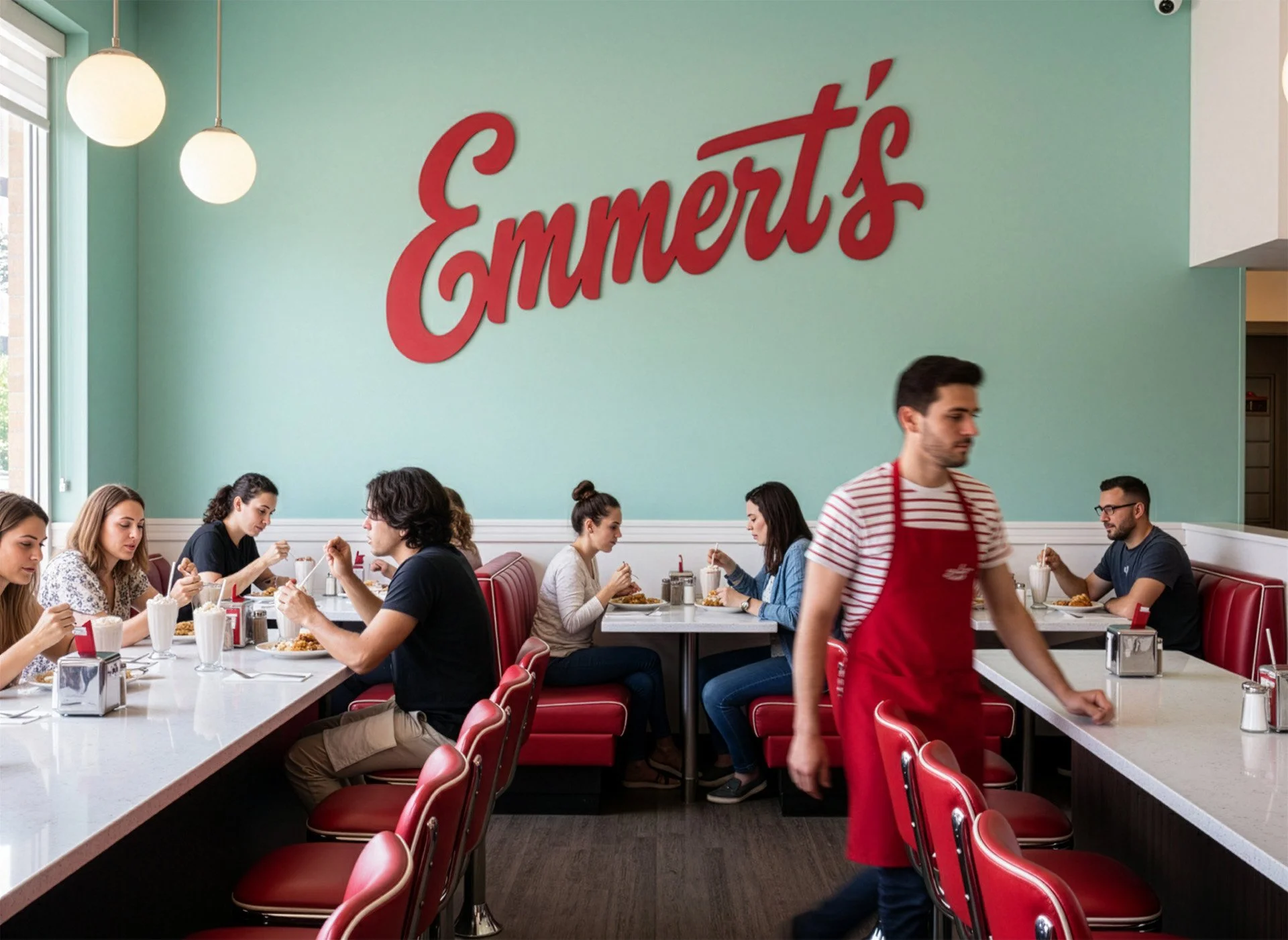
Color Palette: The palette (Red, Cream, Mint Green) was pulled directly from mid-century diner aesthetics.
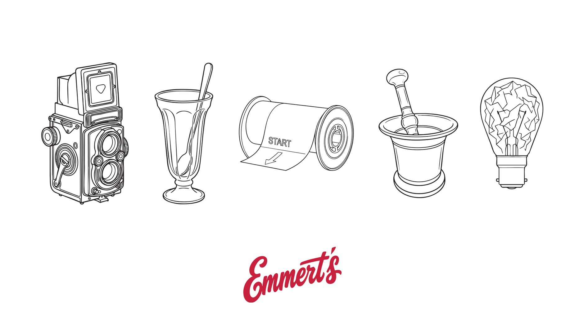
2. The Narrative Thread: To honor the building's history, the menu and line-art illustrations use technical photography terms (e.g., The Double Exposure burger, Darkroom coffee) and camera/chemistry iconography (a twin-lens camera, a developing reel, a chemical mortar). This allowed for a highly specific, differentiated tone.
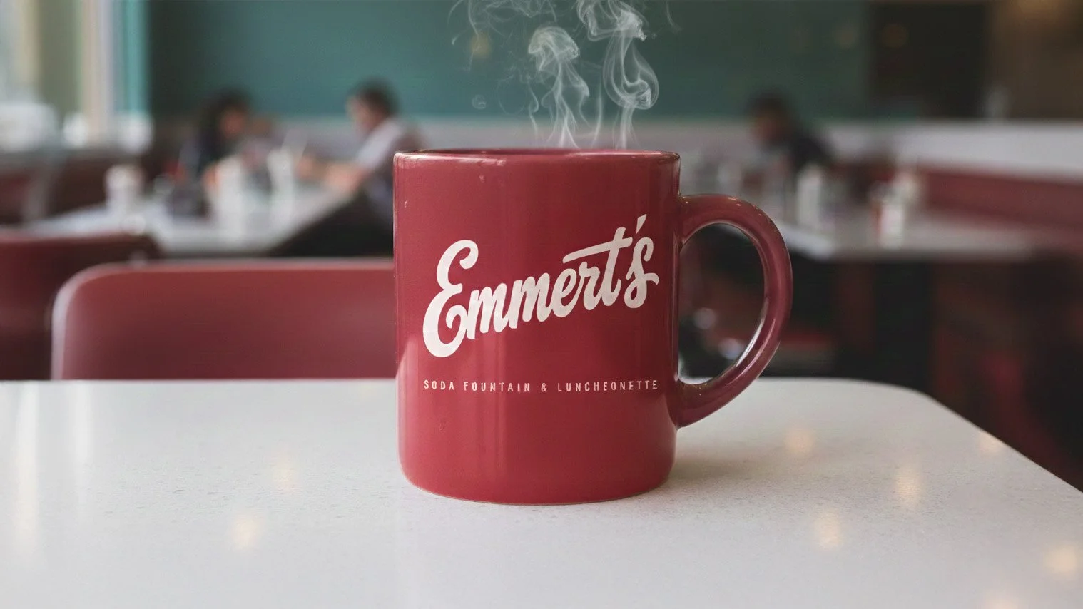
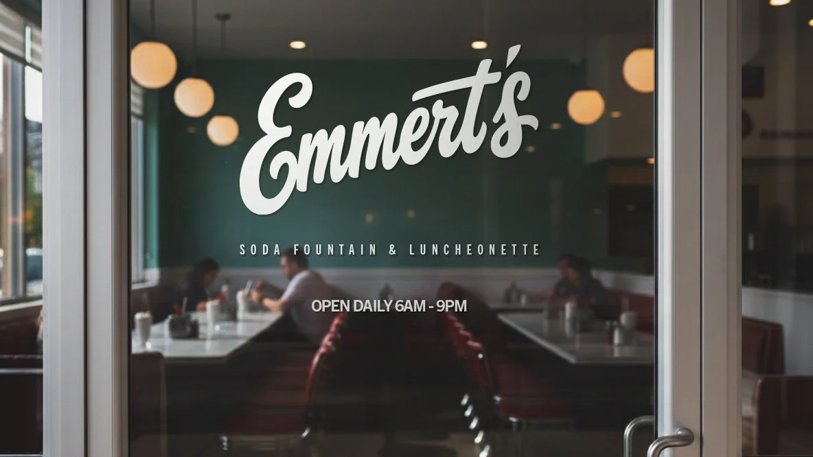
3. Multichannel Execution: The brand was executed across the environment (wall logo, door sign), print (menu), and merchandise (mug).

